what to wear for photos (and why it matters more than you think)
I'll be the one to say it...what you wear will make or break your photos.
I can give you the best light, the best location, and direct you like Steven Spielberg but if the outfits are off, the whole thing feels off. And honestly? That's usually the difference between photos you kind of like and photos you can't stop looking at.
The good news it doesn't have to be complicated. You don't need to panic order a whole new wardrobe or show up in something that doesn't even feel like you. You just need a little intention, a few solid pointers, and someone to tell you what actually works. (And hey! That's MOI!)
I have put together a full styling guide for my clients with outfit ideas, color palettes, and pieces that photograph really well. I'll link it below so you don't have to guess your way through it!

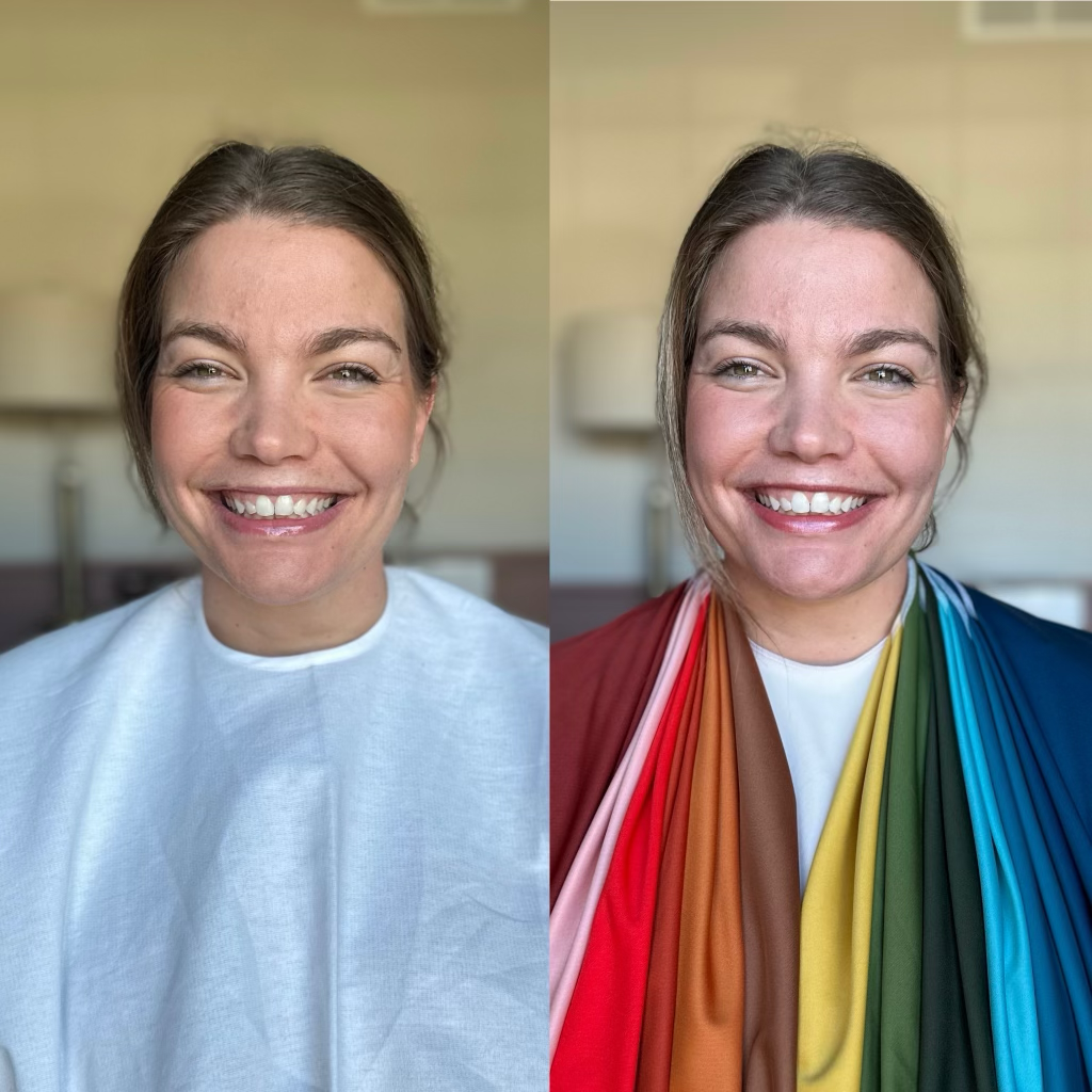
COLORS THAT ACTUALLY WORK
When people search "what colors to wear for photos"...this is what they're actually asking. Not what's trendy, but what photographs well.
My editing style leans warm, golden, and a little nostalgic. So your outfits should live in that same world. Think: earthy tones, soft neutrals, warm golden hues. My husband once asked me if teal was the same color as robin's egg blue, so I getttttt it. There are so many different colors to choose from, how does one possibly even begin to decide? Let's have a moment of silence for Ben after that particular moment, by the way.
Anyways, think: cream, brown, sage, dusty blue, rust. These colors will always photograph beautifully.
Avoid: neon (it will hijack any emotion in the photos!), anything that has logos on it, harsh black and white combos. To be honest with you though, there are sessions where this could work - it all depends on the location and vibe you're picking. A leather jacket with a bright pink tulle dress may not work in the oat field, but it will certainly work in an urban downtown location.


KNOW YOUR "SEASON"
This is where people either look incredible, or slightly off and don't know why.
Not every color works on every person, and forcing it will show in your photos.
Pay attention to your undertones, skin tones, what you naturally feel best in.
I am a true autumn, meaning I positively glow in rust, olive, cream, navy, and warm browns. I look completely washed out when I wear pristine white, or black.
If you lean cooler, like my husband, you may look better in soft blues, muted greens, and cooler neutrals.

Autumn, Winter, Spring & Summer
So how do you find out what season you are? You can go to a specialist like I did (Shoutout to my friend Amy, with House of Color!) - which is the absolute best way to know your true color palette. However, you can also use certain Apps - or even ChatGPT to guide you in the right direction.
This will affect everything from the colors you wear, to the jewelry you look best in!
The question I often get is "Well, what if everyone in my family is a different season? How do we match!?" The good news is...you don't want to match! You want to coordinate. Contrast. You want dimension in your photos.
For example, I am a true Autumn. My husband? He's a soft Summer. One kid is a true Spring, and the other is a soft Autumn. We find a color that coordinates us all, usually somewhere in the neutral family and then build off that. Dress one person first, and then go from there!
TEXTURE, MOVEMENT, AND LAYERS - AND THE DIFFERENCE IT MAKES
If you want your photos to feel cinematic, instead of stiff...this is it. Textures that photograph beautifully:
o linen
o gauze cotton
o knits
o lace
o embroidery
These catch light and shadow in ways flat fabric just can't. Movement matters just as much. Flowy dresses, wide-leg pants, oversized knits. Anything that moves will elevate your photos instantly because, welp. Y'all won't be stiff anymore! And stiff, my friends, equals awkward and ain't nobody want that.
Layers add depth. Sweaters over dresses, button-downs, jackets, dusters. Keep it soft, not bulky like a suit jacket that's two sizes too big. This is how your photos go from "oh, okay, cute!" to "wait, these are insane..."
Oh. Don't forget to accessorize! Belts, hats, cute lil' boots with the fur. These INSTANTLY elevate your outfit into something put together!


PATTERNS, KEEP THEM UNDER CONTROL!
Patterns are not banned - in fact, I encourage them! They're just easier to mess up if you go overboard. First, the more people you have ... the more patterns you can have. If it is just two of you, perhaps only one does a pattern and the other person does a texture like a waffle knit.
My rule of thumb? Let it be the statement piece. Pull colors from it for everyone else. Avoid loud, chaotic prints - unless your location calls for that! Multiple patterns competing can be a bit much visually, so pick the one you love *best*.

HOW TO COORDINATE OUTFITS ... WITHOUT MATCHING!
If you're Googling "family photo outfit ideas", this is the part you need.
Pick 2-3 colors and build around one main outfit. Usually this is you, mom! Example: Mom in a flowy rust dress --> dad in neutral coordinating colors --> kids in complimentary tones.
Done.
Let one outfit lead and let everything else support it. You're not trying to match, you're trying to feel cohesive and natural.

COMPLIMENTARY VS CONTRASTING VS ANALOGOUS
Do you remember this from elementary school? It's the color wheel! I try to suggest either complimentary, or analogous colors first...and then depending on if there are just two people, I go with contrasting! All of these color relationships are great for understanding what looks best together!


WHAT TO WEAR BASED ON YOUR LOCATION
Outfits should match your environment.
That's it. That's the advice.
Kidding, kidding - somewhat. If you're searching, "what to wear for outdoor photos" this is your answer:
Field/Nature:
o flowy dresses, earthy tones, barefoot, soft textures like knits and linen
Beach:
o linen, cottons, neutrals, relaxed, nothing stiff. The wind will have lots of movement, so anything that allows for that like maxi-dresses.
Urban/City:
o darker tones, sleek layers, structured looks, silhouettes.
Forest/Mountain:
o denim, flannel, boots, grounded earth colors that contrast or compliment each other.


WHERE TO SHOP?
Here is what I suggest for clients - let's pick a location first.
And then? Let's pick what mom, or whoever is *booking* the session FIRST.
And then we get to have fun putting together outfits for everyone else, which means we get to shop! Some of my favorite shops to buy from are:
o JAMIE KAY
o KATE QUINN
o RYLEE AND CRU
o J CREW
o H + M
o ZARA
o AMAZON
o FREE PEOPLE
o QUINCY MAY
o OLD NAVY
o COTTON ON
o WREN & IVORY
o ROOLEE
o BALTIC BORN
o TARGET
o INDIE BLUE
o THRIFT STORE (yasss, goodwill!)
o ADELISA AND CO
o LITTLE POPPY
o NORA LEE
o JOYFOLIE
o WORTH COLLECTIVE
Any of these places will set you up for success and offer a wide variety of price points. If you're on a budget, search "linen dresses or outfits for kids" in Amazon. Walmart, Target, and Old Navy all offer solid neutral choices because when all else fails, a cute button up that is left open and khaki shorts go a long way for the men in your family. These places also offer great deals on accessories that will elevate your whole look!
SO NOW WHAT?
Well first, look at my style guide located here:
If you're sitting here thinking, "okay, but like I still don't know what to wear!"...you're normal. I have a very large client closet to choose from with a wide range of colors, sizes, and silhouettes for all environments. I send all of my clients a full styling guide with exact outfit ideas, color palettes, and direct links to pieces that photograph beautifully.


